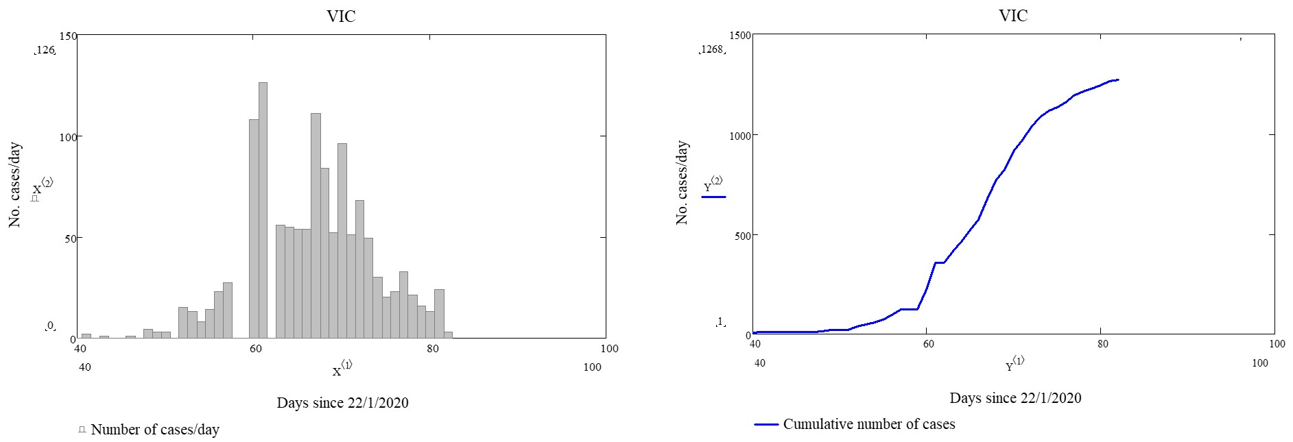
So how did we obtain the predictions made in the previous posts? Well, it’s by a process of complex mathematical modelling. We won’t go into the details here, but instead will try to explain with the help of a few graphs for Victorian data. First – let’s look at the actual number of cases per day and the cumulative tally:
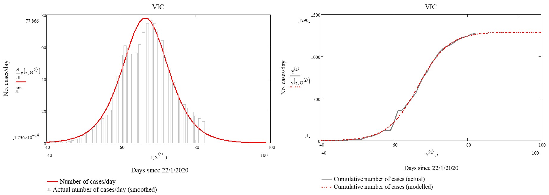
We next fit a complex mathematical model to the cumulative curve above. This gives us the red curves in the figure below. As can be seen, the model fit to the data is very good and so we have confidence in the results – although there is no guarantee that the actual trajectory is duty bound to follow our model!
So, it should now be clear how we got our ‘flat-line’ predictions – we simply extend the model out to future time and see what happens. But what about other questions like when was the rate of increase/decrease in reported infections the greatest? Or what was the predicted date of the peak in rate of infections? We could look to the data for answers to these questions, however real data tends to exhibit a lot of variability (as evidenced by the first two plots above). The advantage of a model is that it ‘irons’ out this variability. If you studied high-school mathematics, you might recall a topic called differential calculus. If we take the red curve on the left hand side of the last plot and differentiate its functional form, we get another curve that shows the instantaneous rate of change in the daily infection rate. An analogy is travelling in a car. The daily infection rate is like velocity or speed – it’s the number of new cases per day. Your speed is the number of kilometers per hour. The derivative of speed is acceleration – it’s the rate of change in speed per unit of time. So the derivative of our infection rate curve represents the rate at which the infection rate is changing. Here are the curves:
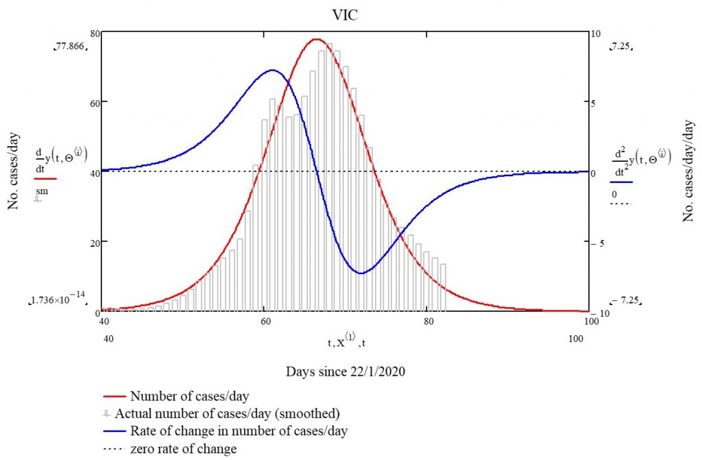
The blue curve above is our ‘acceleration’ in infection rate. It reached a maximum 61 days after January 22, 2020 – i.e. on or around March 23, 2020. On the other hand, the deceleration (rate of decrease) was greatest 72 days after January 22, 2020 – i.e. on or around April 3, 2020. The peak rate of infection is evident as the peak of the red curve, but it is also the point of zero ‘acceleration’ i.e. the point where the blue curve crosses the horizontal zero line. This was 66 days after January 22, 2020 – i.e. on or around March 28, 2020. So there you have it – mathematical modelling 101!