Updated: April 11, 2020
Disclaimer: We have high levels of expertise in statistical modelling. We are not epidemiologists.
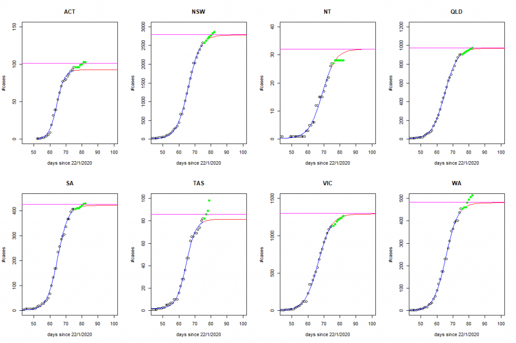
Please refer to our previous post for state-by-state predictions for the number of COVID-19 positive test results. We will add actual data to the graphs of model predictions to assess how well we’re tracking. The latest data are displayed below. The blue line is our fitted model; the solid red line are the predictions; the horizontal purple line is our predicted ‘stable’ level by 20/4/2020; and the green points are actual new data that was not available at the time the predictions were made.
Overall, the updated totals are tracking very closely to what was predicted, although the stand-out discrepancies are Tasmania, Western Australia, and to a lesser degree, NSW which still appear to be on increasing trajectories.